L
longearedfriend
no, it's too far I can't see it
It's some sort of ice mass unit such as square miles...
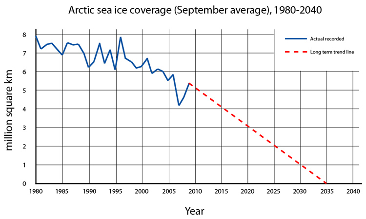
The point is, IT WILL BE GONE IN LESS THAN 25 YEARS.
Here is a better graph, there is tons of info out there.


I think the north pole is rich in diamonds too, the melting ice just makes all the good stuff easier to get to.

...Additionally, even if the trend were trending in that direction, at that rate, it wouldn't intersect with the 'recorded' graph at the point of the most recent record. I would be very skeptical of where/whomever that graph came from, regardless of your stance on the issue.
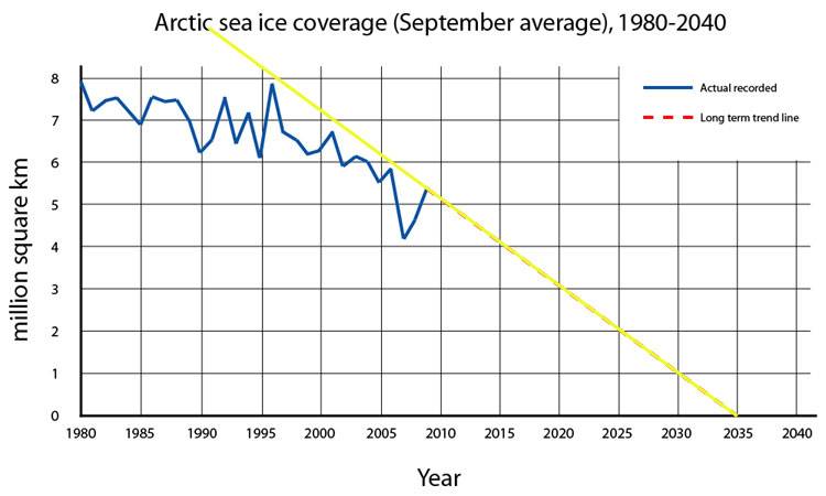
Those ups and downs aren't seasonal, there's 5 years between 1995 and 2000 , with a single peak and a single valley (let alone it kinda says 'September average' in really big, bold letters up there). Likewise, that trend line isn't curved to present a lowering trend, it's just a straight line that touches the record on a single point:

Additionally, even if the trend were trending in that direction, at that rate, it wouldn't intersect with the 'recorded' graph at the point of the most recent record. I would be very skeptical of where/whomever that graph came from, regardless of your stance on the issue.
IDK who put this out but that yellow trend-line is dishonest as hell. Why not start the fucking line at the beginning? Oh I KNOW WHY! B/c it wouldn't support your agenda as clearly. Why do ppl do this shit? Intellectual dishonesty at it's best.Those ups and downs aren't seasonal, there's 5 years between 1995 and 2000 , with a single peak and a single valley (let alone it kinda says 'September average' in really big, bold letters up there). Likewise, that trend line isn't curved to present a lowering trend, it's just a straight line that touches the record on a single point:

Additionally, even if the trend were trending in that direction, at that rate, it wouldn't intersect with the 'recorded' graph at the point of the most recent record. I would be very skeptical of where/whomever that graph came from, regardless of your stance on the issue.
IDK who put this out but that yellow trend-line is dishonest as hell. Why not start the fucking line at the beginning? Oh I KNOW WHY! B/c it wouldn't support your agenda as clearly. Why do ppl do this shit? Intellectual dishonesty at it's best.
I have no idea where it came from but wherever it did you can pretty much discredit the rest of their shit as spin too with such a blatant misrep like that.
Edit: Fun fact. The earth is 6 billion or so years old. The North Pole isn't nowhere close to that old. That means the NP ice has melted completely and came right back all before humans were remotely capable of affecting it.
And what makes you think the Earth is supposed to stay habitable for humans? Who made that rule?Dismissing a scientific calculation with no science just wastes the space it took to type your comment.
Dinosaurs might have lived millions of years but it was only in the confines of an environment that supported them. Humans are a relative blink of an eye compared to the hundreds of millions of years of complex life on earth. You can't possibly suggest wholesale pre-history as habitable for humans.
The line makes the ice appear to disappear at a faster rate than it really is. Why not draw it from the start of the dataset. It still shows the same picture but just not as fast a rate or as alarming of a decline. That's what pisses me off about ppl in either camp on this issue. They all do this to some degree or another.It's idiotic statements like this that now make me understand why these threads get so heated and therefore get deleted.
Any graph is nothing more than a picture of data. The data is factual. The point is that there is becoming less and less ice every year and it is going to hit zero soon if it continues on the course it is currently on. Its called math, it's not really propaganda because none of these scientists are saying WHY it's happening just that it IS HAPPENING.
So if we are in the heart of Global Warming...why does that chart show the biggest rise since 1995?? The dotted line is just a guess, right??
therefor melting ice is a sign that mother nature may not be sitting comfortably for the next few years