What's new
  • ICMag with help from Landrace Warden and The Vault is running a NEW contest in November! You can check it here. Prizes are seeds & forum premium access. Come join in!

Bring your opinionated ass on over....critics are wanted

G

Guest

that has to be the worst piece of art i ever saw!


just kidding! looks good, nice work!
 

VictoryGardener

holy hell
it isn't very clear as to what it is IMO.. I like the farmer crouched over the pot (terracotta soil pot, not pot as in marijuana) but the reefer plant looks fucked up.. it took me a few minutes to figure out what they were... they look like octopus tentacles... it took me a while to figure out they were colas.. I would change that to a more normal looking sexy sativa plant well flowering.. something that actually looks like marijuana, you know?
if the leaves don't OBVIOUSLY look like marijuana, nobody's gonna get it
 
Last edited:

Nikijad4210

Member
Veteran
Overall, a nice logo design.
Buuut...The colas kind of look like a cross between an octopus & male genitalia.....Dicktopus, maybe?
:biglaugh:
 

pieceofmyheart

Active member
Veteran
That is cool as hell man. You did that TC? Well here is a big ole hug for you and your artistic side....and your other side and backside and whatever side.
 
G

Guest

mmmmm purple buds...

It's very nice... but... I'm wondering what the white O is about?

I like the concept.
 
G

Guest

I think it's a peace sign Maistre. I could be wrong

I think it looks great.
 

its kurmit

Member
VictoryGardener said:
no it isn't very good or very clear as to what it is.. I like the farmer crouched over the pot (terracotta soil pot, not pot as in marijuana) but the reefer plant looks fucked up.. it took me a few minutes to figure out what they were... they look like octopus tentacles... it took me a while to figure out they were colas.. I would change that to a more normal looking sexy sativa plant well flowering.. something that actually looks like marijuana, you know?
if the leaves don't OBVIOUSLY look like marijuana, nobody's gonna get it

but i like the logo i got it right away what they were, who needs to kno what it is besides stoners? theyll b the only ones buying his seeds anyway


Nikijad4210 said:
Overall, a nice logo design.
Buuut...The colas kind of look like a cross between an octopus & male genitalia.....Dicktopus, maybe?
:biglaugh:


i was thinkin more along the lines of cocktopus when u said that...
 

Irishslappop

Ganja struetu?
nice man, good color work.

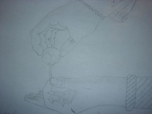
i drew this one up the other day, its up for interpretation :] i cant bring myself to ruin it with my horrible coloring skills.

supportandcontrolreal.jpg
 

pieceofmyheart

Active member
Veteran
That is a very good drawing also Irish, hands are hard to draw correctly. I like it. I think if I were to color it, I would only do the globe and leave the rest black and white.
 
VictoryGardener said:
no it isn't very good or very clear as to what it is.. I like the farmer crouched over the pot (terracotta soil pot, not pot as in marijuana) but the reefer plant looks fucked up.. it took me a few minutes to figure out what they were... they look like octopus tentacles... it took me a while to figure out they were colas.. I would change that to a more normal looking sexy sativa plant well flowering.. something that actually looks like marijuana, you know?
if the leaves don't OBVIOUSLY look like marijuana, nobody's gonna get it

The leaves dont look like marijuana leaves??? Click the thumbnail and open your eyes, for the love of god.

I didn't add more leaves and make it real looking because too many leaves overcrowds the picture and makes it look messy.

And for whoever asked about the circle.....according the the ancient greeks and the renaissance Italians....the circle is the symbol of the perfect shape.....which is a referrence to Moonshineman's "perfect genetics"

But now for me to turn on dickhead mode....The breeder likes it....I personally like it.....so in the end...for those with their negative comments....I would love to see ya do better than I...from your imagination.....and then come and talk to me....okay champ?
 
Last edited:

pieceofmyheart

Active member
Veteran
TrichomusCaesar said:
And for whoever asked about the circle.....according the the ancient greeks and the renaissance Italians....the circle is the symbol of the perfect shape.....which is a referrence to Moonshineman's "perfect genetics"


That's is even more interesting then, cool.

dickhead mode? hahahah trying to see why that would be a bad thing.......lol
 
pieceofmyheart said:
That's is even more interesting then, cool.

dickhead mode? hahahah trying to see why that would be a bad thing.......lol

muahahaha

Honestly....how the hell do those not look like marijuana leaves? They've been foreshortened to make them look like they're actually taking up space in a 3-d world...and not planar to the page....
17586msmtglogo.jpg


Ahhh fuck it.....I think it rocks....and Msm is pleased....so I could care less what the haters think.
 
Last edited:

NiteTiger

Tiger, Tiger, burning bright...
Veteran
I think it's very cool.

It is tough to make out the leaves until you blow it up, but I liked how the colas formed the classic weed leaf shape, so I liked it at both resolutions.
 

Latest posts

Latest posts

Top